Wednesday, March 08, 2006
Finding hidden treasures in OpenOffice 2.0's Charting Wizard
I loved Nancy Drew mysteries. Somehow, Nancy always had a hunch about where to look, in the old clock or the mysterious ballet dancer's closet, to find the jewels, the glowing eye or the kidnapped heiress.
Nancy would have been great at doing charts in OpenOffice 2.0.
The chart features in OpenOffice are like a mystery-lover's dream vacation: a huge, mysterious old house with lots of long halls, secret bookcases, dark closets and creaky doors that, when you peer behind them, reveal wonderful secrets.
Now, I realize that all this mystery can be annoying if you don't have three months of summer to explore the charting features and you just want your darn scatterplot out in a few minutes. Fortunately, even though much of the power of OpenOffice charts is hidden, once you know it's available and where to find it, you can get to it much more easily.
So, here's your tour of the powerful, hidden charting jewels in OpenOffice 2.0.
Setting up the Chart
The chart generates colored lines, bars, or other shapes to show the data. Some of these colors are, well, yucky. Specify the colors you want to use ahead of time -- you can do it later, but this is more efficient.
Choose Tools > Options > Chart > Colors. For any colors you don't like, such as the pale yellow, just select something different. Click OK when you're done.
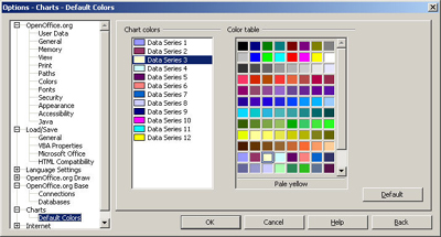
If you want to go the extra mile, you can even choose Tools > Options > OpenOffice.org > Color and make your own colors.
When you're modifying the chart later, you can change the colors too, and you can also use other filler like gradients or even graphics to fill the bar, line, etc.
Making the Chart
Making a chart is fairly simple. There are a few checkboxes you definitely want to mark, however, and a few lists that you should scroll through to see all the options.
The basics:
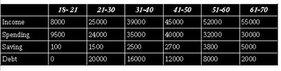
- You make a table, in Writer
- Or you just type up your data, in Calc.
- Select it all, including the titles
- choose Insert > Object > Chart (Writer) or Insert > Chart (Calc).
.
The first window appears, showing the range of data
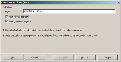
Click Next to go from one window to the other, and specify how you want the chart. At the end, click Create, and the chart appears.
Finding the important selections along the way
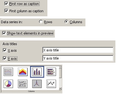
It's tempting to just whiz through and accept the defaults, but you miss stuff that way. When you create the chart, always mark everything you can. If you have the option, as you do here, for labels on the X and Y axes, do it. When you have the option to switch data from rows to columns, try it and see the effect. Scroll through all the options in any window of chart types and variations. Whenever you see any of these items in the wizard, mark them and/or fiddle with them to see how it affects the results.
Modifying the Chart: The Tools
You've got your chart and it looks great.
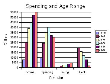
But you just need to change a few things. What do you do to change it? There aren't any attached "change this" or "update this" buttons. It just sits there and stares at you.
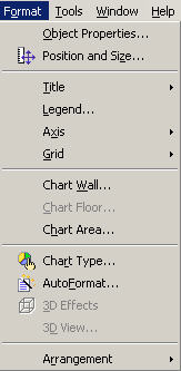
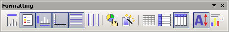
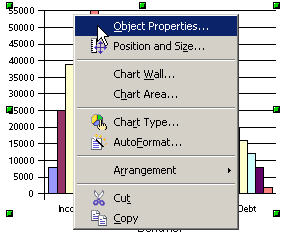
What it lacks in obviousness, OpenOffice makes up for in the many ways to find the tools. They're in four places. You can see these options once you've double-clicked in the chart and at any point thereafter.
- Format menu
- Formatting toolbar
- Right-click and view the context menu. (One of my favorite things to say in training classes is, "when in doubt, right-click." It's good in any situation, not just charts.)
4. Just double-click on what you want
Note: Especially when double-clicking and right-clicking, do so on exactly the item you want to modify.
Of the options listed, Object Properties is especially useful. Chart Wall is the data portion of the chart and Chart Area is the whole chart.
Modifying the Chart: Selecting it the Right Way
Here's a summary of how you need to select a chart in order to use those modification tools. Think of it as an overall guide to the OpenOffice.org equivalent of "push the spine of War and Peace, twist the third candle from the left and the hidden bookcase will twirl around to show you the hidden passageway down to the mad scientist's laboratory."
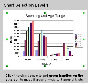
- Select once for green handles to move the chart.
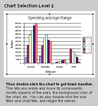
- Then double-click, for black handles that let you resize and modify things like the background color of the chart.
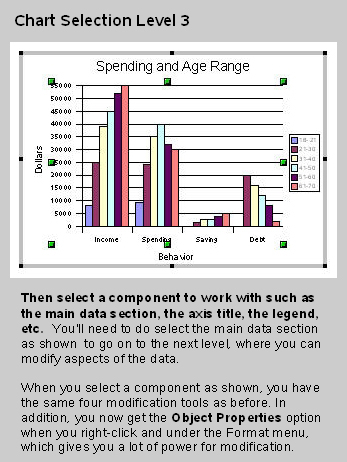
- Then, click again on a particular component to modify it, like the legend, a chart title, the main data section, etc.
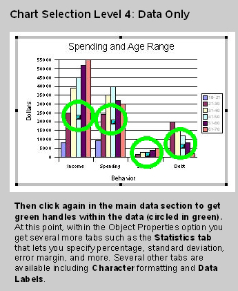
- (Main data section only) Click in the data area to see green handles and modify additional aspects of the data display like statistics.
- (Main data section only) Click on a particular component like one bar in the graph to modify aspects of just that component.
The descriptions of the handles aren't as good as seeing them. Here's what each level looks like, with a summary of what you can do at each level.
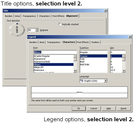
Here are some of the options you can get from right-clicking and choosing to modify the title, the axes and the legend.
If you're not seeing what you need to at this point, go on to level 4.
Here's the difference in Object Properties between level 3 and 4, for the main data area.

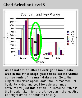
The options for level 5 look pretty much the same as before. The only difference: you just get to apply the options very specifically to the individual selected component.
I would not go out of my way to nominate the OpenOffice.org chart interface for the "Easy-Breezy Intuitive Powerful Yet Simple" award. It is a good tool, once you know where the secret passageways are and how to twist the third candle from the left to get at all the cool tools. A warning: if you get up in the middle of the night to do some charting and you hear violins playing behind the Object Properties window -- don't even think about following it.
Solveig Haugland has worked as a technical writer, course developer, instructor and author in the high-tech industry for twelve years, including six years at Microsoft Great Plains, three years at Sun, and year at BEA. Currently, Solveig is a StarOffice and OpenOffice.org instructor, author, and freelance technical writer. She is also co-author, with Floyd Jones, of three how-to books: Staroffice 5.2 Companion, Staroffice 6.0 Office Suite Companion, and OpenOffice.Org 1.0 Resource Kit, published by Prentice Hall PTR. For more tips on working in OpenOffice, visit Solveig's OpenOffice blog.
source:http://searchopensource.techtarget.com/tip/1,289483,sid39_gci1171394,00.html
![]()
